Look at that, don’t you just want to take a bite out of that big juicy burger? Although I think that the burger looks appetizing I made some errors in photographing it. That’s what happens when you are a starvin marvin and want to snap the shot and get on with eating.
It’s a fabulous tasting burger, but I wasn’t happy with the photos. I decided to turn my negative into a positive. So this post I thought I’d go over some tips rather than entertain you with my bad puns and food inspiration stories. And now I have the perfect excuse to share the recipe even though I think the photo is less than stellar.
To start off I’m going to point out what I did right, because it makes me feel better to point out the good stuff.
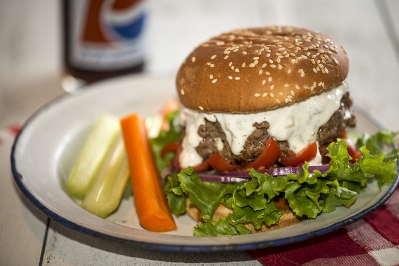
1. The depth of field is good, that is to say the burger is in focus and the background is out of focus, exactly what I wanted since I wasn’t trying to sell Pepsi.
2. I got a nice strong diagonal line by using red as the anchor, see how your eye follows the red napkin, to the red tomatoes, to the Pepsi bottle (which is ironically filled with Coca-Cola…snicker, snicker). A diagonal line tells your eye where to focus and since the burger is bigger than life, you automatically are attracted to it over and over. The carrot also helps replicate the same line.
3. The angle of the shot is effective. You see the burger, bottom bun to top of bun, nothing mysterious about how this burger is composed.
4. Think your condiments go on top? Nope, not in a well styled foodie photo. A little food styling tip is to start with the lettuce on the bottom, then onions and then tomatoes, meat and finally sauce. Sometimes even a second lettuce layer is added. Good job Rhonda, and I even wisely used purple onions which stood out more than white. Plus they go nicely with the blues in the photo.
5. I cooked the burger just right, you can totally tell that this is a juicy burger.
1, 2, 3, 4, 5 I was on a roll (seriously no pun intended)….but there was a lot that could have been done better. Let’s start with the picture above.
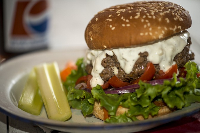
1. I am way too close to the subject. Yes you can still tell it’s a burger, but I’m cropped in so close to the top of the photo that it causes ‘tension’. This is the kind of shot you look at and know you don’t like as well as another but you aren’t sure why. Even with close up shots you need a little negative space to keep the eye in the photo (unless you are shooting macro and that’s an entirely different story).
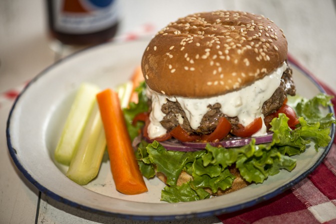
2. In this photo I have the carrot behind the celery, so you see something orange in the background but what is it? And the celery just doesn’t have enough pop, so the photo is too heavily weighted on the right.
3. I layered my condiments correctly but good heavens, the tomatoes look like teeth ferociously trying to gobble the burger. This is what happens when you don’t have a large juicy tomato and you think, I’ll use my cherry tomatoes. The cherry tomatoes could have worked, if I chopped them instead of quartered them then arranged them so that they just peek out.
4. Talk about larger than life, look at that lettuce. I was very careful to make sure that all the pretty curly bits were ruffled around the burger, but I was a little over zealous with the amount. A nice hint of lettuce all around would have been better. I mean, is this a lettuce burger or an elk burger?
5. Holy Niagara of blue cheese Batman! When I first spread on the blue cheese dressing, I made sure to push some to the edges so that it would show. What I didn’t factor in, is that a hot burger would ‘melt’ my blue cheese dressing causing it to cascade over the entire burger. While melting drippage looks appetizing, when you no longer can see the product underneath, well it may have been just a wee bit too much. (It was messy-licious though).
6. But my red onions look perfect…oops, this is critique time…
7. On this shot above, I had corrected the carrot issue, but the photo looks like it’s all about the sesame bun. Compare it to photo #1 and you’ll see what I mean.
8. My lighting is HORRIBLE, which I thought I had grown out of. To my credit I got a new softbox for my Speedlight (late birthday present from McGyver, ahem that’s a whole ‘nother story) and I was experimenting with using it. Unfortunately I can’t fire it off my camera without firing my on camera flash (I would need a remote). The lighting is way too harsh! Plus the flash has given my photos a blueish tone.
Right, enough self flagellation, a poor girl can only take so much! To summarize my points:
1. Leave negative space, even in close up shots.
2. Look at your lines, are they leading your eye to the main subject.
3. Don’t get over zealous with the supporting characters.
4. Don’t EVER use on camera flash.
5. How are your colors playing a roll in your photo, helping or distracting?
6. Look at the angle you are shooting, is it focusing on the main subject or something else?
7. Revel in your mistakes and learn. Share your mistakes and teach.
Photography is a fluid process, the more you do the more mistakes you make but the better you get.


- 1 pound ground meat (I used Elk)
- 2 tablespoon steak seasoning (such as Montreal Steak Seasoning)
- 1/3 cup Buffalo wing sauce (divided)
- 1/2 cup crumbled blue cheese (divided)
- 1/4 cup sour cream
- 1/4 cup mayonnaise
- 1 teaspoon red wine vinegar
- Kosher salt and fresh ground black pepper
- Lettuce, Onions, Tomatoes (sliced) or other favorite burger topping
- 4 hamburger buns
- In a larger bowl gently mix ground meat, steak seasoning and 2 tablespoons of Buffalo wing sauce until well combined. Divide the meat mixture into 8 equal portions and shape into patties. Place some blue cheese crumbles in the center of a patty and cover with another patty, pinch the sides together to seal. Repeat with remaining patties, you should end up with 4 stuffed burgers.
- Grill or pan fry over high heat until a nice crust is formed on the outside and the burger is cooked to your likeness.
- Blue Cheese sauce: in a small bowl mix remaining blue cheese, sour cream, mayonnaise, red wine vinegar and salt and pepper.
- Toast buns if desired.
- To assemble, spread some Buffalo wing sauce on bottom bun, add favorite toppings and burger, smother in blue cheese dressing and top with a bun.
- To make your own Buffalo wing sauce melt 1/4 cup butter and whisk in 1/2 cup of Franks Red Hot sauce (no substitutions).


SO much to think about! You did an excellent critique…I will have to do the same with my next photos! Thanks!
Isn’t that the key, doing an excellent critique and not beating yourself up. I know I’m hard on myself but it helps me to improve!
Elk meat and bleu cheese… YUM! Looks like a delicious burger and had you not mentioned all the stuff you did “wrong” I bet few people would have noticed 🙂
Karen, I bet you are right not everyone would have noticed, or even cared. But for those who do, I’ll happily share my failures 🙁
Even during your critique, Rhonda, you (fortunately) couldn’t contain your great sense of humor.
Some excellent and very helpful tips. Especially enjoyed the words of wisdom in step number 7.
A question for you, Rhonda. Would you ever consider shooting this or other burgers open faced to focus more on the burger and less on the bun?
And, just finished photographing something very white and pale. Used your tip from the mushroom soup post to add some side color–oh what a difference it made. Thank you, Rhonda.
Janice, I would absolutely consider shooting a burger open faced, more likely with the top bun tilted off to the side a bit but not completely removed. Most of us eat a burger that way. I’m glad that the tip made a difference.
Thank you, Rhonda, for sharing these tips. I tend to get too close to the subject too.
The burger sounds really delicious!
Angie, sometimes it’s hard to step back a little. I think that cooks and photographers love details which is why we have a tendency to zoom in on them.
I would have set the top bun tipped off the meat a bit, like he’s tipping his hat. The meat shows well and it makes an appetizing photograph. Nice job on that burger! LOVE, LOVE green leaf lettuce. Nothing prettier!
Michelle, I sometimes shoot my burgers with the top bun tipped if there is a special ingredient on top that I want to show off. In this case I was going for some nice cascading blue cheese…of course it went a little over board. I agree wit about leaf lettuce, it’s so beautiful.
What great tips Rhonda. I love this ‘learning from failures’ – they present the most opportunity to educate, in a lasting manner! Thank you!!!
The burger, regardless of how it was photographed looks like I should sink my teeth into it now! Thanks for making me hungry.
Although I learn best from my own mistakes I always glean something out of others, or in the very least if I repeat their mistake I know what I have done wrong.
I LOVE THIS ARTICLE! Any time we can step back and take a look at our mistakes is a victory for ourselves. I am relatively new to taking pictures of my dishes, so this is very helpful. I currently use my Iphone and my canon point and shoot, I get decent pictures, but I know I need to upgrade. Thanks for sharing.
MiMi, a point and shoot camera takes great photos and it’s great to practice with. You can work on styling and getting the lighting right. One day you’ll realize that you’ve out grown it, even so it’s the photographer who takes good pictures and the not camera.
Rhonda thanks for this post. Your points make lots of sense, I see it the same way! =)
Thanks Helene!
Are you really saying don’t ever use a camera flash? I have heard some people say you can point the flash not directly on the food, but upward to create some fill light. I try to do natural light when I can. I haven’t mastered using my flash, yet.
Stephanie, I am referring to the flash built into the camera. I have successfully bounced my Speedlight (SB 900) flash off a wall or ceiling to get a nice diffuse lighting on food but I only do that when I’m at an event or something. Still, nothing is better than natural light as you already know.
It’s lunch time here and regardless of the photo issues, that burger looks AMAZING! Your tips are great too. My biggest issue is with my lighting. I don’t get a ton of natural light in my house so I feel like my photos always have a yellowish hue to them. Thanks so much for sharing.
Jenny, thanks. Lighting is tough, next to styling I think it’s the most difficult to get right. Do you use any post processing programs like Adobe Lightroom? The color can be corrected easily. If your camera allows you to do custom white balances you could do that, check your owners manual, it really works.
This is just amazing to me that you’ve learned so much that you can critique the photo like an expert. Impressive observations. Really nice photography tips Rhonda. Thank you!
Lea Ann, it’s so much easier to critique than to praise ourselves. Doing a post like this helps me re-enforce what I’ve learned. I will probably be doing more since I never stop making mistakes 😉
The tips are great. I’ve been slowly learning how to shoot and style my food subjects but it can be very challenging. Your tips are helpful, and I find that reading posts such as yours and others like it are extremely helpful.
Thanks so much for sharing,
Joanne/Winelady Cooks
Great tips! Thank you for all of this. I’m such a novice that it’s usually only by accident that I get a good shot. Making food look appetizing is so hard. The lighting is what always gets me.